Button Component
The Button Component is a configurable call-to-action (CTA) element that allows content authors and developers to customize its appearance and behavior through various options:
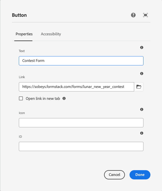
- CTA Text Allows you to set the visible button label or call-to-action message (e.g., "Learn More", "Shop Now").
- CTA Hyperlink: You can define the destination URL the button should link to.
- Link Target Option: Supports opening the link in the same window or a new tab (_blank) using checkbox, based on user preference.
- Icon Support: Enables inclusion of an icon by specifying a CSS class (e.g., icon-arrow-right). The icon can be positioned alongside the button text.
- ID Attribute (for Click Tracking): Allows adding a custom id to the button for analytics or tag-based tracking.
- ARIA Label (Accessibility): Provides an optional aria-label attribute to describe the button's purpose for screen readers, enhancing accessibility compliance.