Slider Component
The Slider Component is a versatile carousel module designed to showcase a series of slides containing images, text, and call-to-action buttons. It offers flexible layout and content options to support promotional messaging, storytelling, or feature highlights.
General Configuration Options
- Banner Width: Choose between Container Width (aligned with page content) or Full Width (edge-to-edge display) to fit the design context.
- Carousel Type
Select the type of slider content:
Image Only
Text with Image
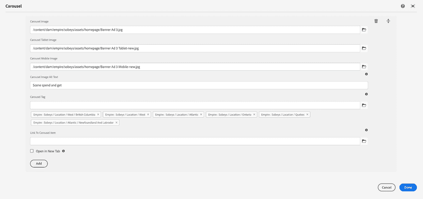
Carousel Items (Repeatable)
Authors can add multiple carousel slides using the repeater functionality. Each item includes the following sections:
Image Section:
- Carousel Image – Main image for desktop view
- Tablet Image – Image optimized for tablet viewports
- Mobile Image – Image optimized for mobile viewports
- Image Alt Text – Descriptive alt text for accessibility
- Carousel Tag – Optional tag or label to highlight slide category or theme
Desktop
Image Dimension: 1920 x 350