
Icon Card Component
The Icon Card Component is a flexible and visually engaging content block that allows authors to display a group of icon-based cards in a customizable layout. It is ideal for highlighting key features, services, or values in a compact format.
Header Section Configuration
- Heading – The main title of the icon card section
- Description – Introductory text to provide context or description for the card set
- Columns per Row – Define the number of cards to display per row (selectable between 2 to 5 columns)
Card Repeater Configuration
Authors can add multiple cards using the Add button. Each card includes:
- Icon – Select or upload an icon/image to represent the card visually
- Image Alt Text – Descriptive text for the icon to ensure accessibility
- Heading Text – Title for the individual card
- Description – Supporting text for each card
- Sub Icons – Option to add one or more supplementary icons beneath the description (for ratings, tags, etc.)
Bottom Section Configuration
An optional bottom section allows authors to add follow-up content or a call-to-action:
- Bottom Heading – Additional title displayed below the cards
- Bottom Description – Supporting text or summary
- Link Title – CTA label text
- Link to Page – URL or internal page link, with an option to open in a new tab
- Link ARIA Label – Optional accessibility label to describe the purpose of the link
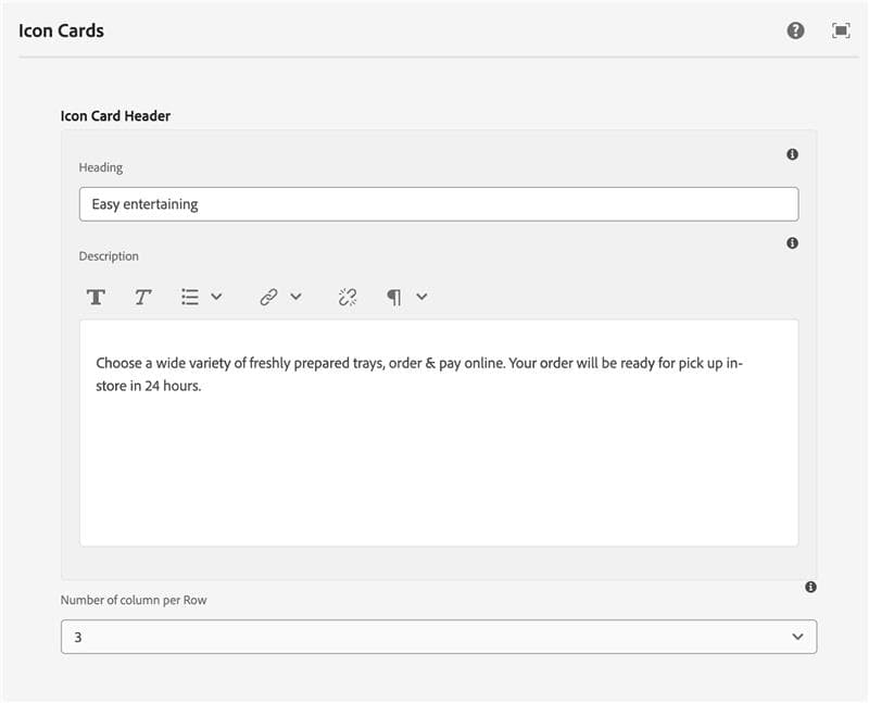
Easy entertaining
Choose a wide variety of freshly prepared trays, order & pay online. Your order will be ready for pick up in-store in 24 hours.

Don't Have 24 Hours? Find delicious, ready-to-serve options in-store
or orders of 10 trays or more, please contact the store directly
if the trays must be ready in less than 48 hours.
You can also visit or call the Deli department in your local Sobeys to place an order.