
BS Card Component
The BS Card Component is a flexible, visually engaging content block designed to present key information alongside images and actionable CTAs. It supports a variety of customization options for layout, color, and interactivity.
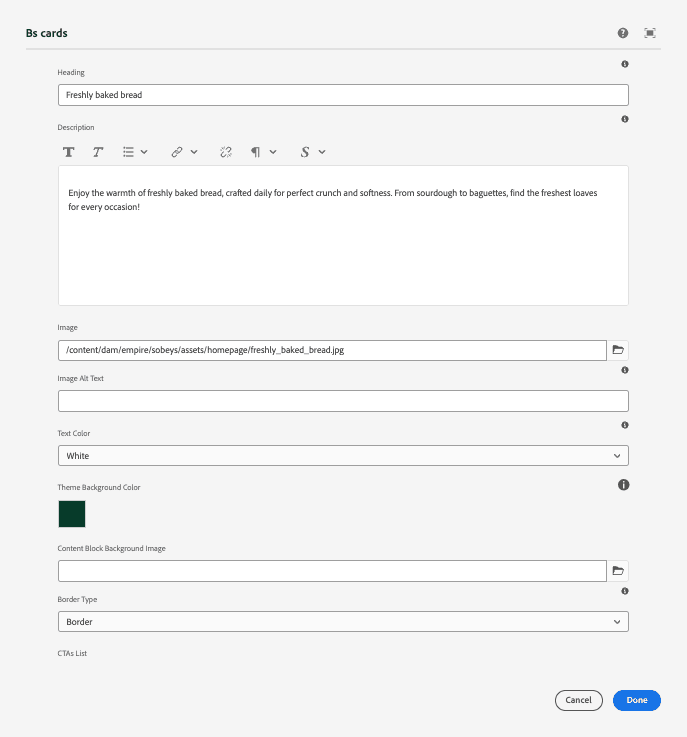
Main Configuration Fields
| Field Name | Description |
|---|---|
| Heading | Main title or headline of the card. |
| Description | Supporting text or content under the heading. |
| Image | Image displayed within the card (e.g., top or side layout). |
| Image Alt Text | Descriptive alt text for screen readers and accessibility. |
| Text Color | Choose between black or white for card text, depending on background. |
| Theme Background Color | Select background color from the predefined color palette. |
| Content Block Background Image | Optional background image for the entire card content area. |
| Border Option | Enable or disable card border and box shadow styling. |
CTA List (Repeatable Section)
Authors can add multiple call-to-action (CTA) items using the Add CTA button. Each CTA includes the following options:
| Field Name | Description |
|---|---|
| CTA Text | Label or text for the link or button (e.g., "Learn More"). |
| CTA Link | URL or internal page path to navigate to. |
| Open in New Tab | Option to open the link in a new browser tab. |
| ARIA Label | Optional label for screen readers to describe the purpose of the link/button. |
| CTA Type | Choose from: Plain Link, Button, Outline Button, or Voila Button. |
| CTA Icon | Optional icon class to display alongside the CTA text. |
Use the repeater to add multiple CTAs, each with unique styling and behavior as needed.
Authoring Tips
- Use Image Alt Text and ARIA Labels to ensure accessibility compliance.
- Select text color based on your background to maintain readability.
- Mix and match CTAs (e.g., primary button + plain link) to guide user interactions effectively.

What is Lorem Ipsum?
Enjoy the warmth of freshly baked bread, crafted daily for perfect crunch and softness. From sourdough to baguettes, find the freshest loaves for every occasion!