MoreItem Component
The MoreItem component is designed to showcase featured items with flexible column controls and an engaging visual presentation.
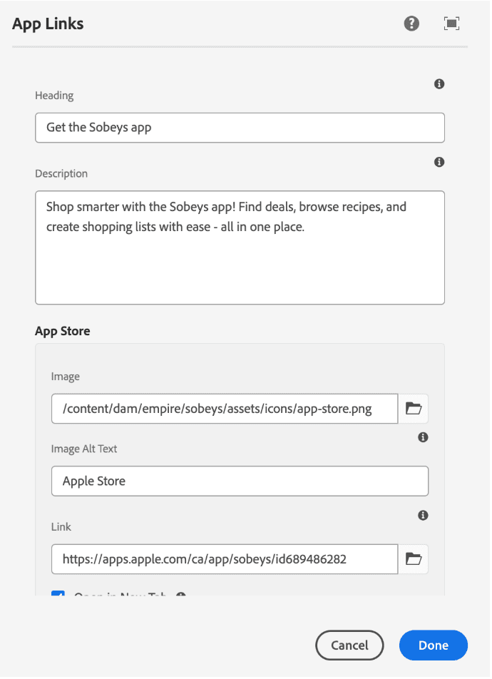
Component Overview
- Heading (Main): A prominent title to introduce the component.
- Description Text: Brief explanation about column control options.
- Image Section: Displays a main image with zoom/modal functionality for enhanced viewing.
- Grid Layout Section: Responsive grid showcasing multiple item cards with customizable columns (supports 2 or 3 columns).
- Card Design: Each card includes an image with rounded corners and subtle shadow, a bold title, and a “Learn More” link button.
- Responsive Design: Layout adjusts across screen sizes for optimal usability and presentation.