Icon Card Component
The Icon Card Component is a flexible and visually engaging content block that allows authors to display a group of icon-based cards in a customizable layout. It is ideal for highlighting key features, services, or values in a compact format.
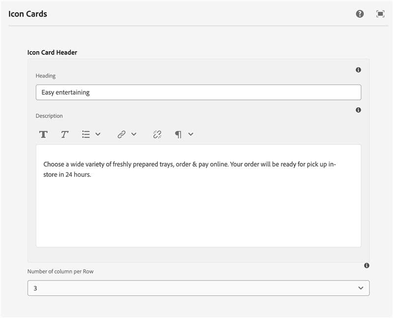
Header Section Configuration
- Heading – The main title of the icon card section
- Description – Introductory text to provide context or description for the card set
- Columns per Row – Define the number of cards to display per row (selectable between 2 to 5 columns)
Card Repeater Configuration
Authors can add multiple cards using the Add button. Each card includes:
- Icon – Select or upload an icon/image to represent the card visually
- Image Alt Text – Descriptive text for the icon to ensure accessibility
- Heading Text – Title for the individual card
- Description – Supporting text for each card
- Sub Icons – Option to add one or more supplementary icons beneath the description (for ratings, tags, etc.)