
Accordion Component
The Accordion Component allows authors to create expandable content sections with optional partner and store card support. It is fully configurable and supports reusable, dynamic content blocks through repeatable fields.
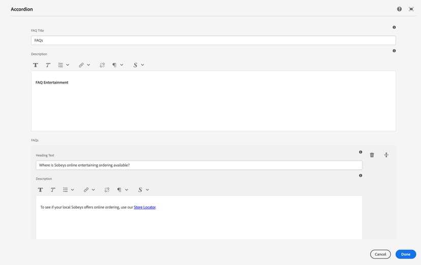
Main Configuration Fields
- FAQ Title: Defines the main heading/title for the accordion section.
- Description: Adds introductory or supporting text below the section title.
FAQs (Repeatable)
Used to add multiple Question & Answer pairs. Each FAQ item includes:
- Heading Text – The question or title of the accordion item
- Description – The corresponding answer or detail content
- Add Button – Allows adding multiple FAQ items dynamically
Each accordion panel can include associated Partner Cards. Fields for each Partner Card:
Used to add multiple Question & Answer pairs. Each FAQ item includes:
- Image – Partner logo or image
- Title – Name or title of the partner
- Title Link – Optional link applied to the title
- Open in New Tab – Boolean option to open link externally
- Add Button – Enables adding multiple partner cards per panel
Store Cards (Optional Inside Accordion)
You can also display Store Cards under the accordion section. Each Store Card includes:
- Store Title – Name of the store
- Description – Store details or highlights
- Add Button – Supports multiple store cards through repetition
Accordion Section
We accept returns within 30 days of purchase. Items must be in original condition.